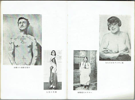
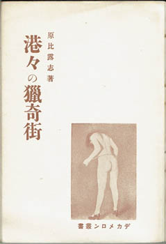
Hiroshi Hara [?]. [Minatominato no Ryokigai]. Tokyo, Fuzoko Shiryo 1931 [Showa 6]. Octavo publisher's illustrated wrapper (a bit used); photo illustrations on ten pages, 167pp and three page publisher's list. Part of the series Dekameron Sosho. Au$200
A modest but characteristic contribution to the ero-guro-nansensu (erotic - grotesque - nonsense) fashion of late Taisho and early Showa Japan: jaunts among the strange denizens of ports. The small grainy photos are a gathering of the expected seamy misfits, outcasts and dock lowlife in the ports of the world mixed with a couple of baffling innocuous views and bar scenes from films. It will probably make sense to those who can read the book: the chapter headings - there are ten chapters of course - do seem to connect to the photos.
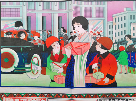
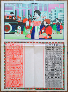
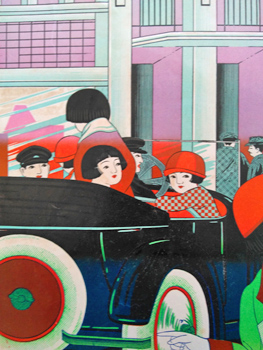
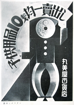
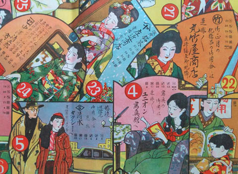
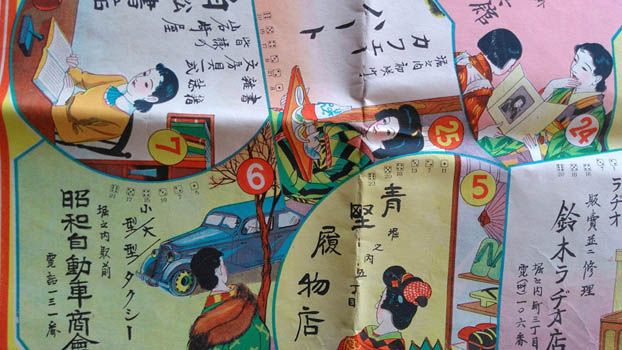
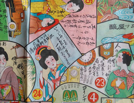
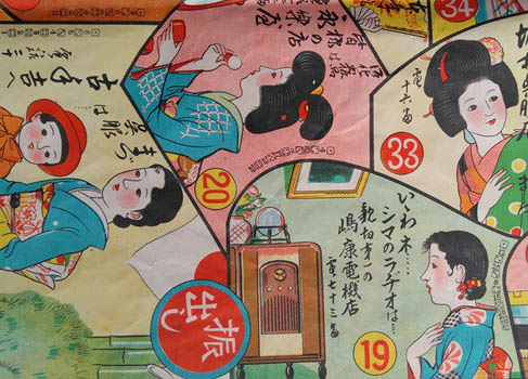
Specimen hikifuda. Hikifuda of women and children shopping. n.p. [1931]. colour broadside 53x38cm. Folded, with stab holes indicating it was once in an album. Au$125
A vivid and heart warming portrait of the urban well-to-do and the rewards of being well-to-do: modernity and shopping. It can be seen as mother daughter life lessons. Many such images in Japan are moral lessons, showing girls and young women their compensation for being good.
These hikifuda - small posters or handbills - were usually produced with a blank text panel. The customer, usually a retailer, had their own details over printed. The handy calendar is for 1932.
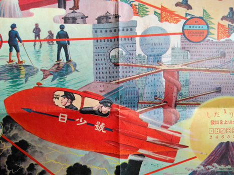
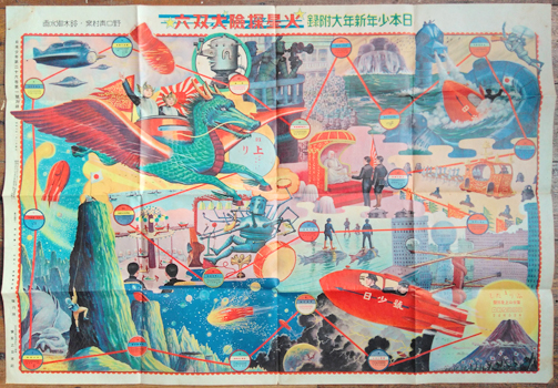
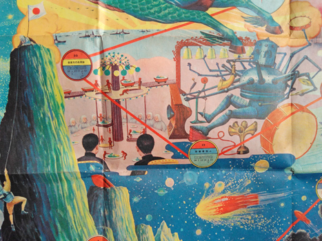
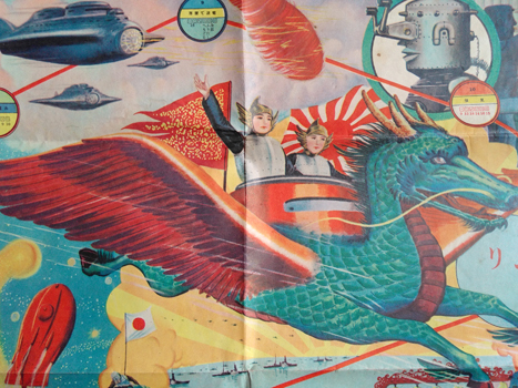
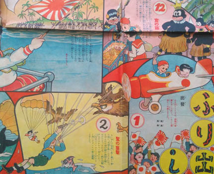
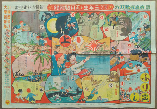
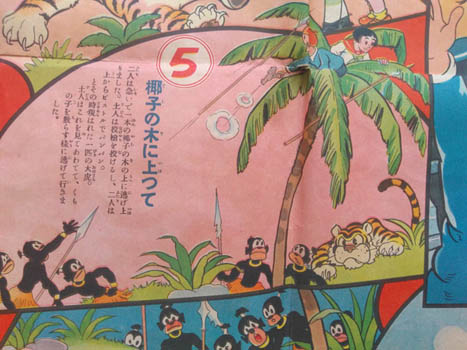
Suzuki Gyosui. [Kasei Tanken Dai Sugoroku]. Tokyo, Nihon Shonen 1931 (Showa 6). Colour broadside 54x78cm. A little browning and a couple of spots; rather good. Au$450
The new year gift from the boys' magazine Nihon Shonen is a splendid, faithful record of these Japanese boys' expedition to Mars. Artist of many parts, Suzuki had accompanied some intrepid boys on a ferocious zeppelin tour of the world the year before this and made a specialty of battle scenes in later years. Before this he produced gentle night scene woodcuts.
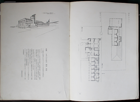
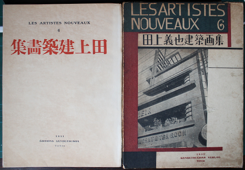
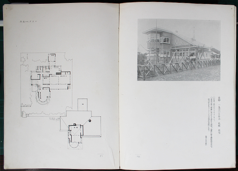
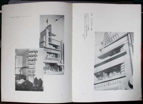
Tanoe [or Tanoue or Tanouye] Yoshiya. [Tanoe Yoshiya Kenchiku Gashu]. Tokyo, Kensetsusha 1931. 27x19cm publisher's printed wrapper, illustrated card slipcase (this marked and a bit worn but solid); 110pp, photo illustrations, renderings and plans. Rather good. Inscribed and signed by Tanoe to artist, later folklorist, and dogged communist Hashiura Yasuo who gets a passing mention in the book. Au$1850
Tanoe began his career working for Wright on the Imperial Hotel - from 1919 to 1923. He then headed off to Hokkaido and is now an architectural hero of the island. The prairie style is evident in some of these early houses but no more than Japan is evident in the prairie style. I read somewhere that for one of the buildings in this book he kept his original plan rather than the compacted plan that was actually built. This was so that his sense of space was preserved.
I think the rest of this Artistes Nouveaux series - maybe seven titles in all - are all painters including three Europeans: Matisse, Vlaminck and Chagall.
Worldcat finds no copies outside Japan and it's not common in Japan.
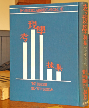
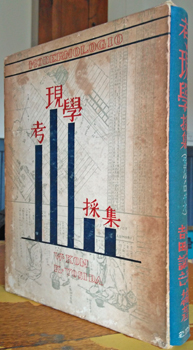
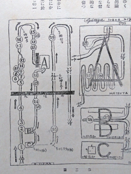
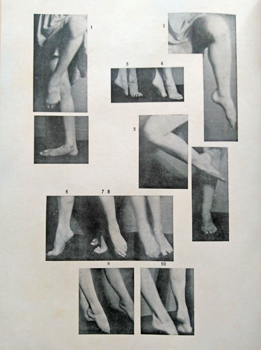
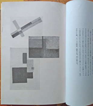
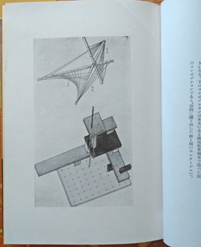
Kon Wajiro & Yoshida Kenkichi. ( ). [Kogengaku Saishu (Moderunorojio)]. Tokyo, Shun'yudo 1931 (Showa 6). Quarto publisher's cloth blocked in red and white (spine a little rubbed), rather browned but solid illustrated slipcase; [2],323pp, photo illustrations, hundreds of line drawings and diagrams (one with colours added), endpaper map. A few blotches and small flaws, quite good. Au$750
First edition of the companion to the 'Modernologio' of the previous year - together they are the gospel of Modernology. Kon and Yoshida here collect data to extend their extraordinary encyclopaedia of the people of modern Tokyo. Their thesis was that those who do the planning, designing and building know nothing of what people actually do, what they own and how they use those things - how they live and who they are. I can't imagine anything you might ever think about and a lot you would never think about that isn't collected here. How you walk, where you walk, what you carry, how you carry it, where you dance, how you dance, how you sit, where your shelves are and what's on them, in your cupboards ...
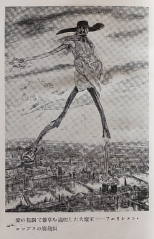
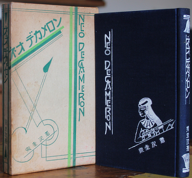
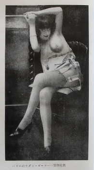
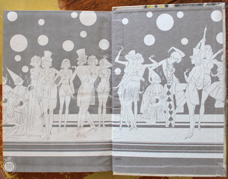
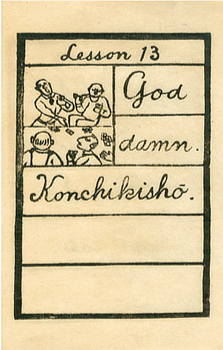
Izumi Keiji [ed]. [Neo Dekameron] Neo Decameron on the cover. Tokyo, Bunshodo 1931 (Showa 6). 18x11cm publisher's decorated cloth blocked in white, printed card slipcase; 49 plates (one colour) from various sources. A nice copy. Au$200
First edition. A pleasing example of the ero-guro-nansu (erotic-grotesque-nonsense) craze of the early showa period. This is a stylish gathering of salacious pieces that would normally appear in pulp magazines. What caught my eye is the piece which sort of translates as 'The Electric Artificial Maiden's Secret Room' which sums up the whole notion of ero-garu-nansu. This jostles with sex murder in the Shanghai British Concession and plenty more. The illustrations are pinched from louche sources, mostly European I'd say.
Neo Decameron it may be but there are 21 stories, not ten. Worldcat finds no copy.
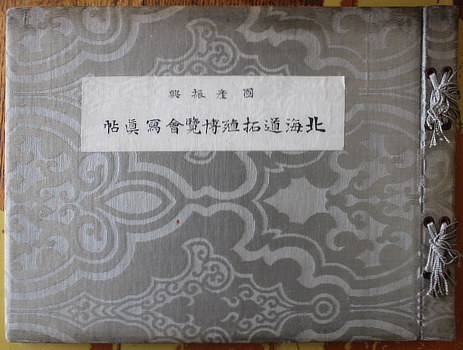
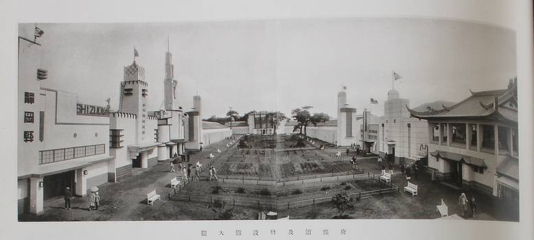
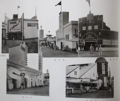
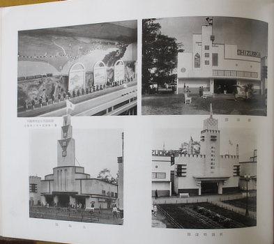
Exposition - Hokkaido 1931. [Kokusan Shinko Hokkaido Takushoku Hakurankai Kinen Shashin Jo]. Hokkaido Takushoku Hakurankai, 1931 (Showa 6). 27x37cm publisher's patterned silk, cord ties (browning around the edges); title page, photo illustrations on 35 leaves of heavy gloss paper, 12 pages of text and a plan. Au$600
A luxurous celebration, with exemplary printing, of the 1931 Hokkaido Colonization Exposition. Had you heard of it before now? Me neither. Thankfully the important old men who always head such books don't take up too much space and it gets more interesting the further we go in. What's wonderful is the number of pavilions that might have come straight out of the pages of the exposition volume of the Gendai Shogyo Bijutsu Zenshu - the Complete Commercial Artist - of 1928-30. Either the same designers were at work or the organisers handed out copies of the book and said, "go for your life."
At the very end we find what seem to have been the big draws for the 600,000 plus visitors: the human cannonball, the world's fattest woman, and dancing girls.
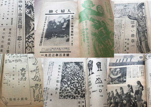
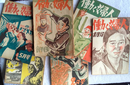
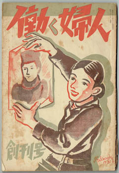
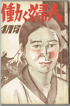
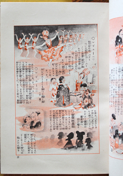
[Hataraku Fujin]. No. 1 to no. 5, no. 8, no. 11 and Vol. 2 no 3/4 Tokyo, Nihon Puroretaria Bunka, Jan - Nov 1932, April 1933 (Showa 7, 8). Eight issues in colour illustrated publisher's wrappers 22x15cm; contents range from about 140pp to about 70pp but the numbering of some issues is alarmingly erratic, b/w illustrations, monochrome photo illustrations. No.8 must have been a troubled issue; it is particularly humble and seems to have been assembled in careless haste. Expected browning of the cheap paper, signs of use but all rather good. Au$1500
Maybe eight elevenths - or eight thirteenths, or not - of the whole run of this trouble making left wing magazine for the Working Woman. It's hard to untangle. I can't find any complete set of these original copies. A reprint, probably not complete, was made in 1980 which seems to include eleven issues running from January 1932 to a March/April 1933 double issue - eight for 1932 and three for 1933. I found a mention that no issues appeared some months. The issues here are numbered by the month they appeared - which may mean there are gaps in the numbering of a complete run or that there are issues no-one has found. The holdings of 13 university libraries in Japan put together seem to add up to v1(1 -10) for 1932 and v2(1-3) for 1933 but the numbering is iffy even then.
Being a communist in Japan in the thirties was a fraught business and the foundation of the Nihon Puroretaria Bunka Renmei - Japanese Proletarian Culture Federation - late 1931 and the flourish of Proletarian books and magazines in 1932 and early 1933 was a last stand of the left. Being gaoled was one thing, being tortured and killed another. In her novel '1932 no Haru' (Spring 1932) writer Miyamoto Yuriko incorporated her editorship of early issues of this magazine, arrest after the April 1932 issue (on the right in the picture here), and the torture and death of poet Konno Dairiki. This wasn't her last arrest and Konno's wasn't the last death.
Virtually nothing written in the last few decades on Japanese culture in the twentieth century doesn't mention 'Working Woman' while no-one, it seems, has read or even seen all of them.
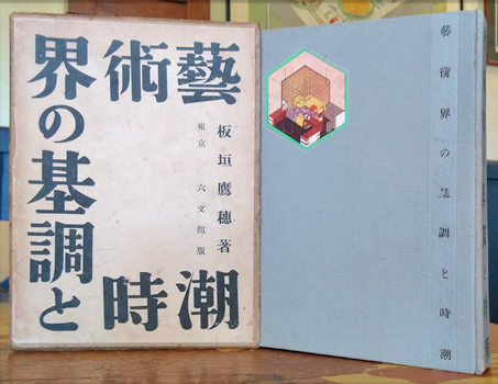
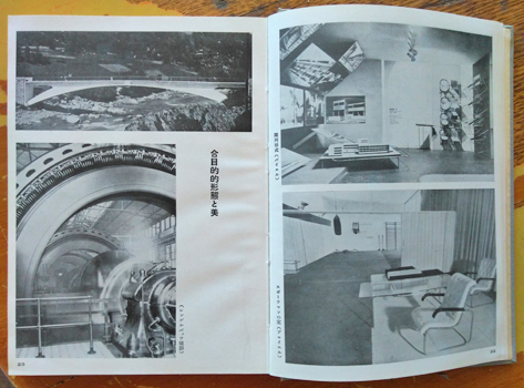
Itagaki Takao. [Geijutsukai no Kicho to Jicho]. Tokyo, Rokubunkan 1932 (Showa 7). 22x16cm, publisher's cloth with onlaid colour illustration, mildly used printed card slipcase; 428pp including 36 pages of photo illustrations. Rather good. Au$650
First edition. Itagaki was seemingly indefatigable as a champion of modernity and modernism in the late twenties and early thirties. Between 1929 and 1933 he worried at the relationship of the machine to art, design, architecture, photography and film, propounding his concept of "machine realism" in a small bundle of books like this. Come the deadly government crackdown on Itagaki's natural disputants - the "proletarian realists" - he apparently retreated into conservative didactic writing on western art and film.
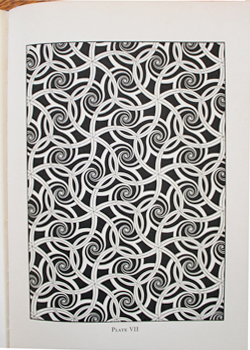
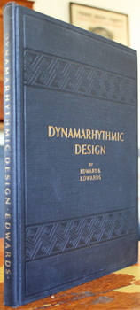
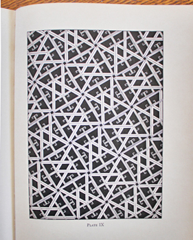
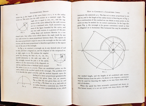
EDWARDS, Edward B. Dynamarhythmic Design. A book of structural pattern. N.Y. Century 1932. Small quarto publisher's cloth; xx,122pp, 28 plates, numerous illustrations through the text. Rather good. Au$300
First edition, not easy to find in good shape. Whatever we think of the theories of Jay Hambidge, drawn from his perceived rediscovery of the Egyptian and Greek system of symmetry, Edwards use of them has produced "one of the most attractive and ingenious studies of geometric ornament [and] one of the few examples of European geometric design to rival Islamic work in complexity" (Durant: Ornament).
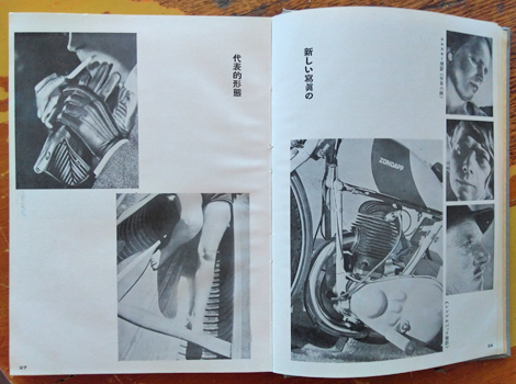
Manga. [Jinsei Mangacho]. Tokyo, Kodansha 1932 (Showa 7). 20x14cm publisher's colour printed cream cloth and colour printed slipcase; 330pp and publisher's advertisements; colour frontispiece. illustrated throughout, the first 32 pages in red and black, the rest in black. Spine a touch browned, edges and case a bit more so; a remarkably good copy of a book born to be a grubby wreck. Au$300
First edition; jazz age manga for grown up kids by a gang of manga stars. The cover, box, endpapers and title page are by Sugita Santaro.
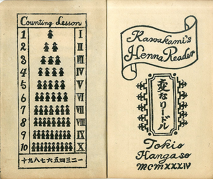
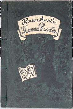
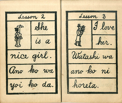
Kawakami Sumio. [Henna Ridoru] Kawakami's Henna Reader. Tokyo, Hangaso 1934 (Showa 9). 19x13 publisher's illustrated dark green wrapper printed in white and darker green; 16pp woodcut printed. Au$400
Kawakami's work is charming, simple to the point of naive so of course it isn't. Kawakami nursed a nostalgia for a time he did not experience. I'm sure there's word for that which isn't nationalism, xenophobia or popularism. In his case it was the Meiji enlightenment and the confusion of westernisation that fascinated him, particularly primers for children. Here is his. Henna translates as strange or weird; they were all weird but Kawakami is purposeful.
*These pictures of the contents have been stolen from somewhere else; I didn't want to squash this nice fresh copy to photograph the inside. This copy is better.
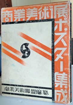
Posters. [Shogyo Bijutsuten Posuta Shusei]. Osaka, Shogyo Bijutsu Renmai 1934 (Showa 9). 27x20cm publisher's patterned boards and slipcase printed in orange and black (this fairly rubbed but solid and presentable enough); [5]ll and 104 b/w plates printed on one side. Au$300
Short on colour maybe but still a good exhibition of modern Japanese poster designs mounted by the Commercial Art League (Shogyo Bijutsu Renmai). Designs - not printed or published posters - with artists all identified. Not such a rare book but hard to find in better than revolting condition.
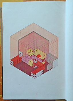
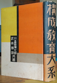
Kawakita Renshichiro & Takei Katso. [Kosei Kyoiku Taikei]. Tokyo, Gakko Bijutsu Kyokai Shuppan-bu 1934 (Showa 9). 22x16cm publisher's colour printed boards (a bit spotted with small surface scrapes at the tips); [2], 12 plates (four colour), 520pp, profusely illustrated throughout. Some spotting around the edge; a rather good copy of a vulnerable book. Au$1650
First edition. A textbook in a way but a remarkable and thoroughly modernist one. Much influenced but, I'm told, not slavishly, by the Bauhaus method of teaching, this education in design or composition contains both the philosophy and practice of Kawakita's Shinkenchiku Kogei Gakuin (School of New Architecture and Design) successor to his Seikatsu Kosei Kenkyusho (Research Institute for Life Configurations).
The book apparently caused some unhappiness among cutting edge architects who complained that it was too abstract but was hugely popular among art teachers. This might explain why the book seems so hard to find: a bunch of black thumbed, paint spattered art students soon puts paid to any book. Worldcat finds only the NDL entry.
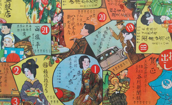
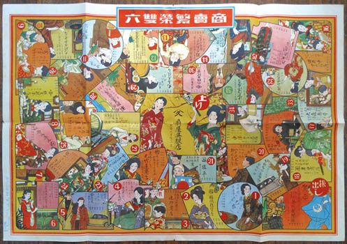
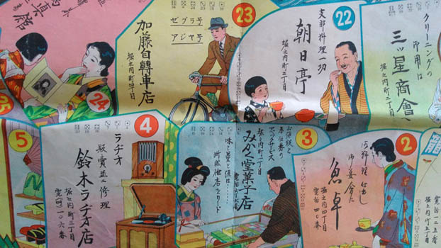
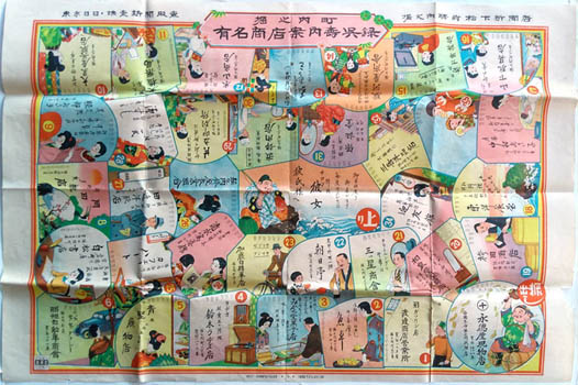
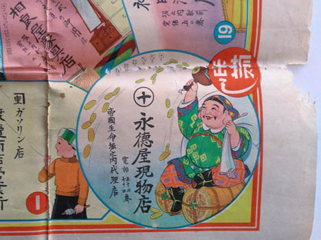
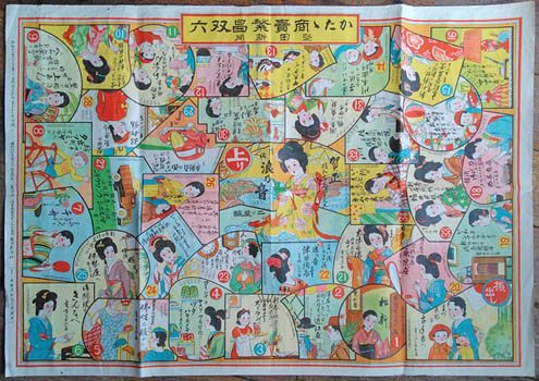
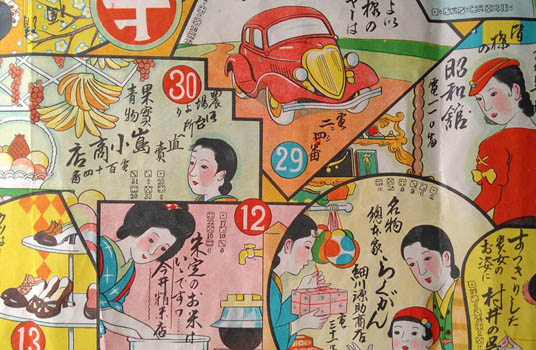
Advertising Sugoroku. [Shobai Hanei Sugoroku]. Tokyo printed, Notagawa Ekimae Shoten 1935 (Showa 10). Colour broadside 79x55cm. Minor signs of use, a pretty good copy. Au$400
A proper aspirational sugoroku for girls and young women. Prosperity is the reward for the perfect modern girl: good husband, handsome family and shopping, shopping shopping. This shopping game advertises the glamorous range of businesses in Notagawa - now part of Higashiomi, more or less half way between Kyoto and Nagoya. The same game, relabelled, was used for businesses of Matsumoto City. A very similar - a few panels the same - but not so modern game - more kimonos, fewer cars, furs and bobbed or marcelled heads - with the same title was issued the year before by the newspaper Tokyo Nichinichi Shinbun for readers in the Iwamurata-machi area. You don't waste a good idea and a decent bit of artwork.
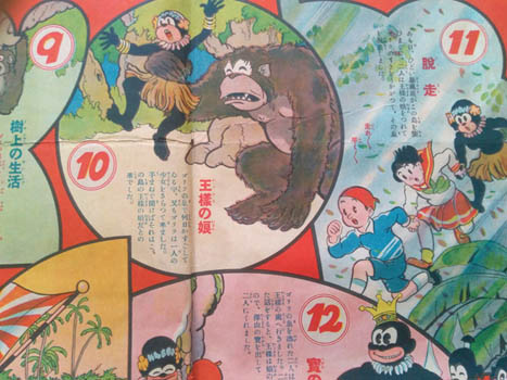
Niizeki Kennosuke (?) [Boken Manga Takarajima Tanken Sugoroku]. Tokyo, Shogakukan 1935 (Showa 10). Colour broadside 54x78cm. A bit used: rumpled with some short tears in folds. Not bad. Au$325
This exciting adventure with the natives, giant apes and tigers of a coral island was the new year gift from the Shogaku magazine for third graders. An exemplary lesson as to why every eight year old should be issued a service revolver before they leave the house.
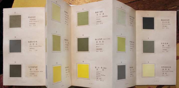
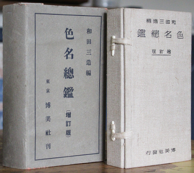
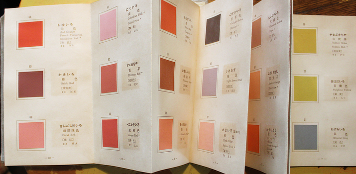
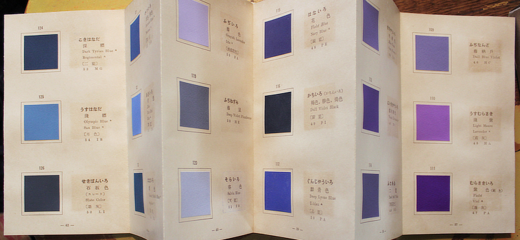
Wada Sanzo. ( ) [Shikimei Sokan (Zoteiban)]. Tokyo, Hakubisha 1935 (Showa 10). 19x11mm publisher's cloth case with 171 mounted colour samples on 57 accordian folding leaves; and card bound book; 182,8pp. Colour samples named in Japanese, English and occasionally French or German; table of multi language lists of colour names. Less than usual offsetting, rather good in original printed card case with two folds repaired. Au$800
Second edition, enlarged and revised, of Wada's first serious attempt at colour nomenclature published in 1931. I can tell you there are a few more pages and eleven more colour chips in this edition. There seem to be significant changes in the text volume but I can't read them. Several colours have changed - that is the hue, tint or shade, not the name - and seem to this untrained eye to accord better with their names, though I would still pick an argument with his 'fawn'.
Wada, though at the top of the art ladder in Japan, insisted on pursuing new directions and founded the Japan Standard Color Association - now the Japan Color Research Institute - in 1927. In these early years science, art and aesthetics went hand in hand.
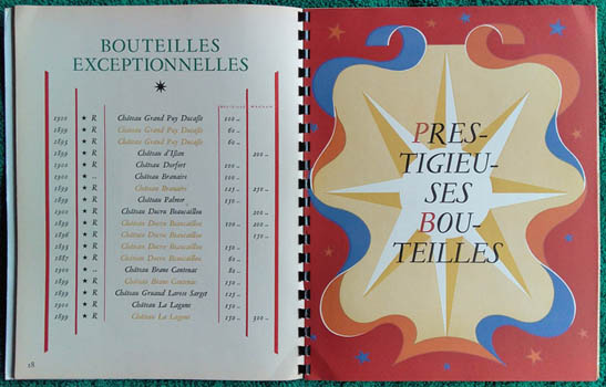
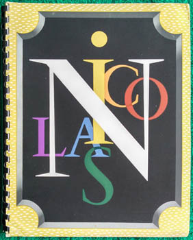
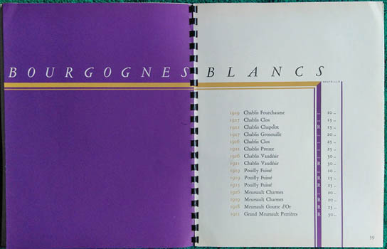
Cassandre. Catalogue - wine. Establissements Nicolas. Liste des Grands Vins Fins 1936. Paris, Nicolas (printed by Draeger) [1936]. Small quarto publisher's colour illustrated wrapper, plastic spiral bound; 54pp including endpapers, some double folded leaves carry four page numbers, Design, decorations decorations and typography by Cassandre. Corner bumped. Au$110
The wine merchants of wine merchants, Nicolas, produced these catalogues of their great wines annually from 1927 to 1973. 1936 is more extensive and stately than its immediate neighbours.
Sugoroku. [Yumei Shoten Annai u Kure-Roku]. Tokyo, Hirohidesha 1936 (Showa 11). Colour broadsheet 54x79cm. Chewed in the left margin and along a couple of folds, marring a bright copy. Au$210
A rare, cheerful shopping game advertising the businesses of Horinouchi-cho. As there are any number of Horinouchi-chos spotted around Japan I'm not sure which one but as this seems to have come from the newspaper Tokyo Shimbun I'm guessing it's around Tokyo. I came across one other copy of the game but it has a different title and advertises different businesses in a different area.
Advertising sugoroku. [Katata Shobai Hanjo Sugoroku]. Katata Shimbun 1936 (Showa 11) Colour broadside 54x79cm. A somewhat rumpled but decent copy. Au$200
A rare, cheerful advertising game featuring local businesses, issued as the new year gift by the newspaper Katata Shimbun. I'm not sure where the Katata Shimbun originated. I can't find a record of it. Katata is an area now in Otsu, near Kyoto, but that it comes from there is a guess.
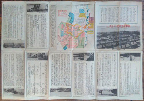
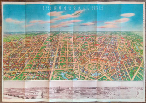
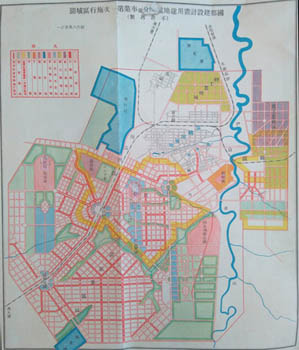
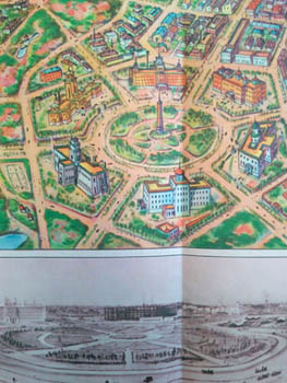
City Planning. Xinjing or Shinkyo (Changchun) - Manchukuo. [Kokuto Shinkyo Kensetsu no Zenbo]. Shinkyo, Manshukoku Kokumuin Kokuto Kensetsukyoku 1936. Colour printed sheet 54x78cm with colour bird's eye view and panorama on one side; colour plan, smaller b/w photo illustrations and text on the other. Folded as issued, a small knick in a margin, minor signs of use. Au$750
In many ways the new capital of Manchukuo was - is - a planner's dream. Here was an empire building militaristic government wanting to both experiment with all that had been learned about city planning and show the west that not only could they do it, but do it better.
Changchun, a hybrid Chinese-Russian-Japanese railway town, was appointed the new capital, it was renamed, a five year plan for a new city was drawn up under the guidance of Professor Riki (or Toshikata) Sano in 1932, a quick compromise with a competing plan was made, and building was underway in early 1933.
Local interests (ie the Chinese and Manchu population) and business were allowed notional input but the brief was clear: social theory, technology and architecture that made for an efficient colonial capital could be put into place, local self-interest could not. Of course it was not so simple. This was to be a pan-Asian showcase, superior to western, especially colonial western, models - not equal. Confucianism, traditional ritual and Asian racial harmony were to be a central part of the city. What more could any urbanist ask for?
Students of the plan might like to start with Yishi Liu's 2011 doctoral thesis, 'Competing Visions of the Modern;' where Griffin's Canberra plan and Griffin's diagrams for road classification are illustrated beside Xinjing's. By 1936 - when our view of the future city was produced - a lot was still dust and open space but, by the gods, whatever else they learnt from Burley Griffin's Canberra - and it was a lot - about planning a city, they certainly learnt how not to build a city.
What they already knew is what all architects know - by instinct? - to redraw plans to fit what has been built and what is likely to be built. This is, I think, the third or fourth of such views of the new city. There were similar prints in 1933, maybe in 34, and 35. The city was declared open in 1937. I'm yet to see the first but the changes between 1935 and 1936 are noteworthy. The plan is much the same, mildy shrunk, and some buildings in our imaginary bird's eye view may reflect actual building but what becomes clear is that ambition has been scaled back to come closer to what they thought could exist next year. City blocks of large scale housing are now more sparse clumps of bungalows; elaborate Sino-Japanese modernism is plain modernism.
Poster. [Osaka Yuryo Senshoku Mihonichi]. [Osaka 1936?]. Colour poster 77x53cm. Folded, some browning and offsetting; pretty good. Au$400
This sinister warning of looming evil advertises the Osaka textile trade fair. Signed in print by the artist but I can't read it.
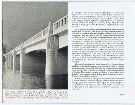
Bridges. Portland Cement Association. Architectural Design of Concrete Bridges. Concrete for permanence. Chicago, Portland Cement [1937]. Oblong quarto publisher's printed wrapper; 36pp, photo and other illustrations throughout. Au$60
'Fundamental principles', that is the rules of design - appearance as separate from structure - are succinctly set out and illustrated by recent modern and moderne bridges. Mistakes are shown and corrected in diagrams.
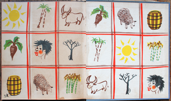
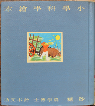
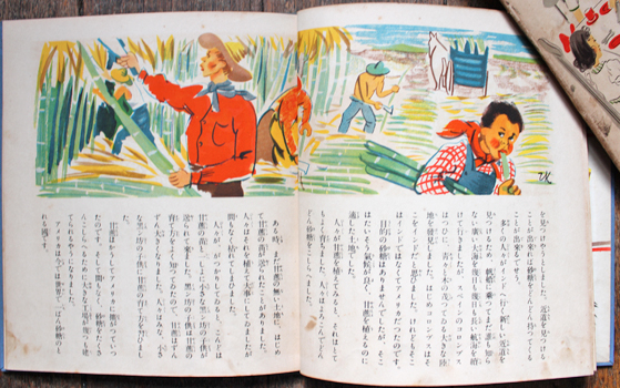
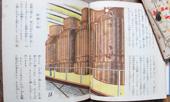
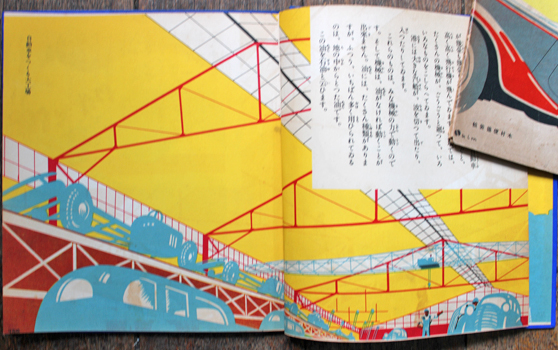
Kurita Jiro (illustrator). : [Shogaku Kagaku Ehon : Sato]. Tokyo, Mitsukoshi 1937 (Showa 12). 215x195mm, publisher's boards with mounted illustration, dustwrapper (this worn and browned but all there); colour and b/w illustrations throughout by Kurita. Some browning of offsetting. Au$80
This is volume 12 of the 12 volumes series Shogaku Kagaku Ehon - elementary science - devoted to sugar. This is a quite exciting and vivid series hidden under dreary dustwrappers so it is natural to discard the dustwrappers immediately. They seemed inexplicable to me until I realised that many of these artists were in disgrace with officials and neither high modernism nor the fanciful were suitable for anyone let alone an impressionable child. The dustwrappers are the book equivalent of thick rimmed glasses and a false moustache. Proof that communists and such troublemaking artistic riff-raff can't be trusted.
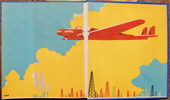
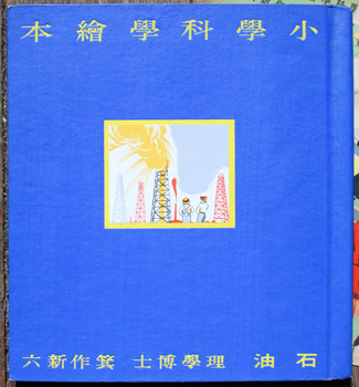
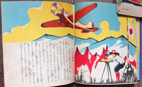
Yamashita Ken'ichi (illustrator). : [Shogaku Kagaku Ehon : Sekiyu] . Tokyo, Mitsukoshi 1937 (Showa 12). 215x195mm, publisher's boards with mounted illustration, dustwrapper (this used: browned and a bit chipped); colour and b/w illustrations by Yamashita throughout. Some browning here and there. Au$150
This is volume 10 of the 12 volumes series Shogaku Kagaku Ehon - elementary science - devoted to oil. This is a quite exciting and vivid series hidden under dreary dustwrappers so it is natural to discard the dustwrappers immediately. They seemed inexplicable to me until I realised that many of these artists were in disgrace with officials and neither high modernism nor the fanciful were suitable for anyone let alone an impressionable child. The dustwrappers are the book equivalent of thick rimmed glasses and a false moustache. Proof that communists and such troublemaking artistic riff-raff can't be trusted.
  6 7 8 [9] 10 6 7 8 [9] 10   |